Swarthmore College Data Visualization Group
SAM Data Exploration
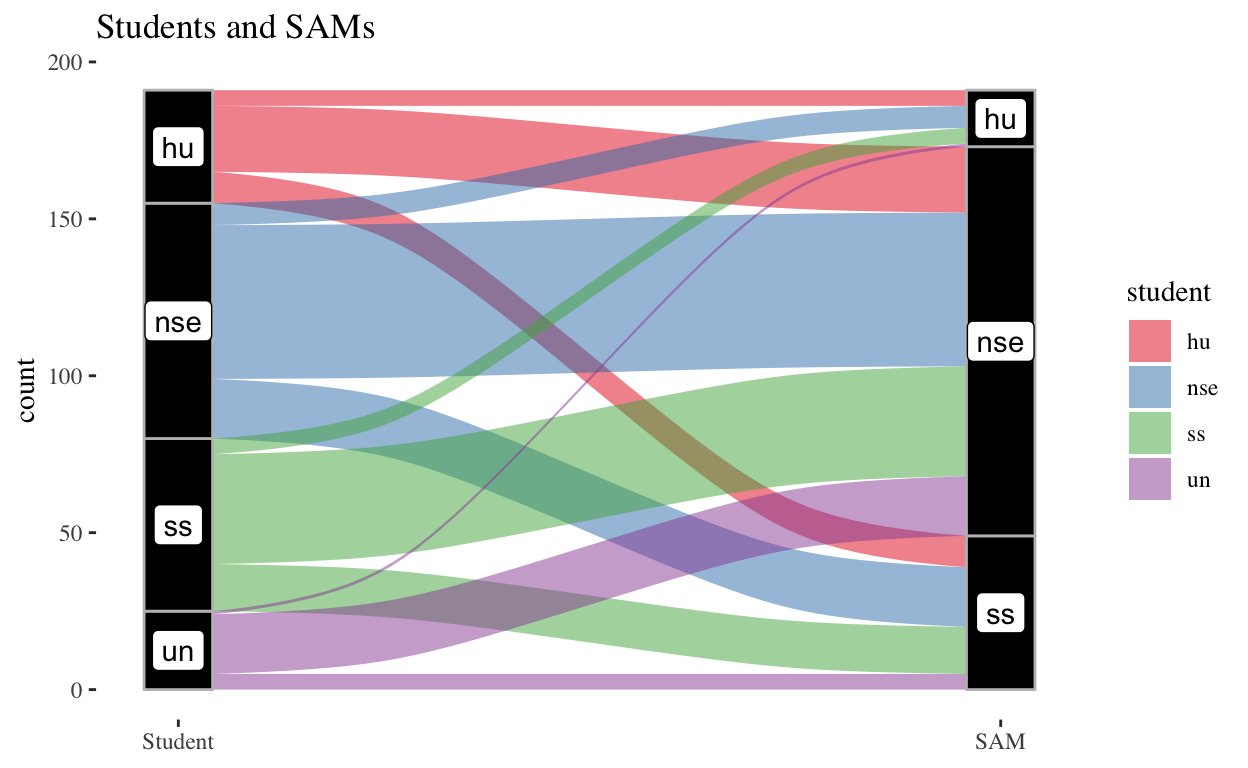
Using alluvial plots and chi-squared tests to see whether the academic division of a specific Student Academic Mentor (SAM) impacts the type of students that reach out to that SAM.
Lesson on Linear Regression
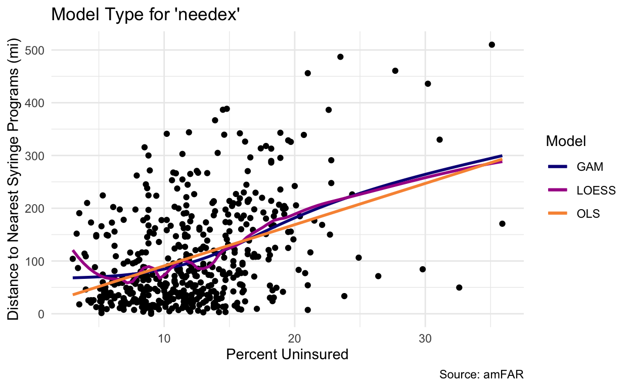
An overview of Linear Regression using data from the Foundation of AIDS Research
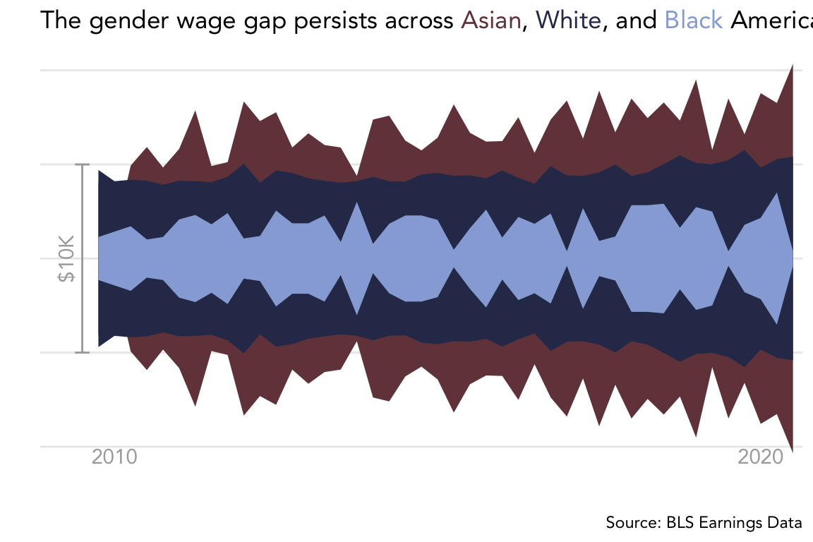
BLS Earnings Data
Visualizing the gender wage gap for #TidyTuesday – includes a demo of customizing ggplots!

DuBois Challenge
A recreation of a Du Bois line chart for #TidyTuesday
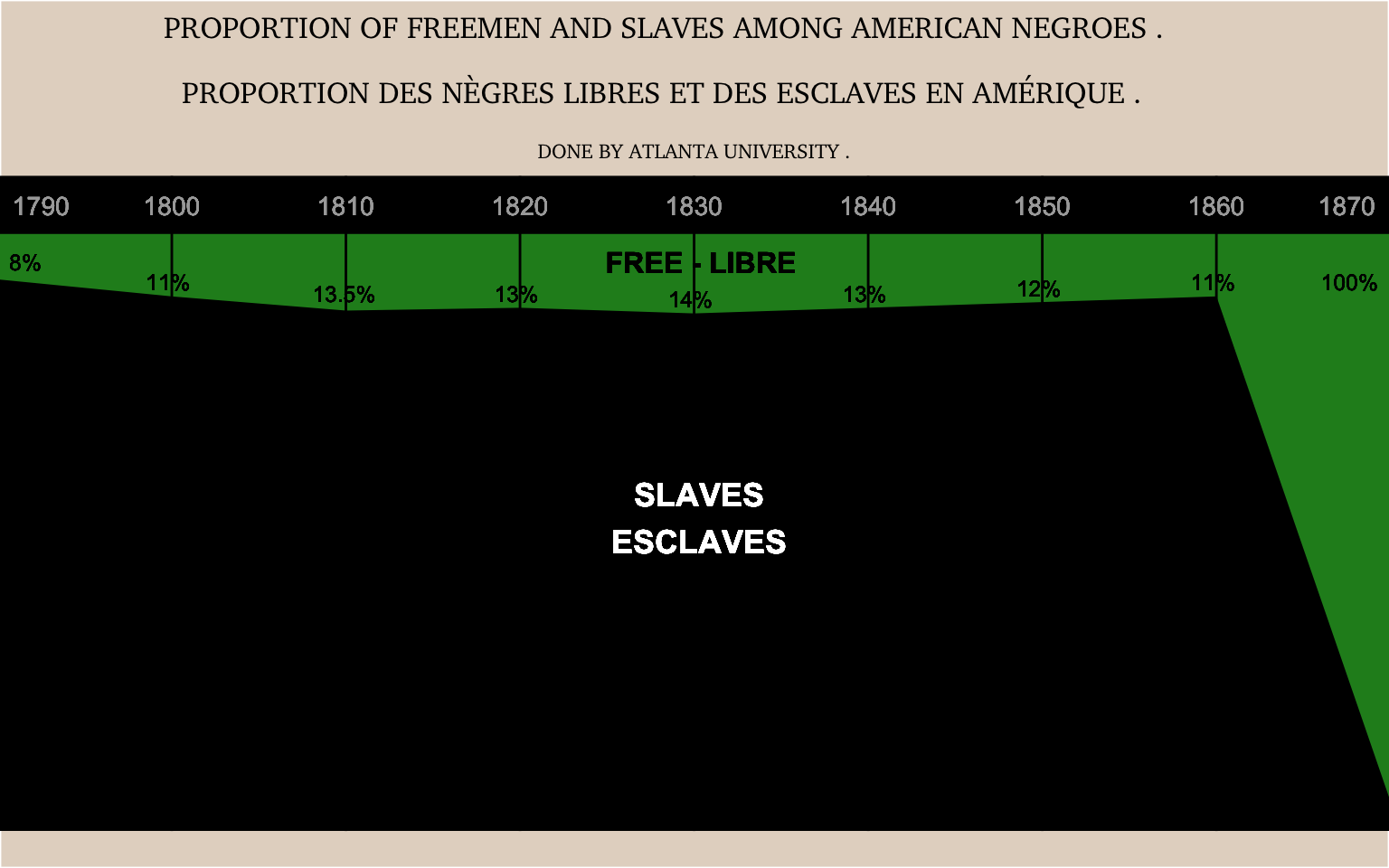
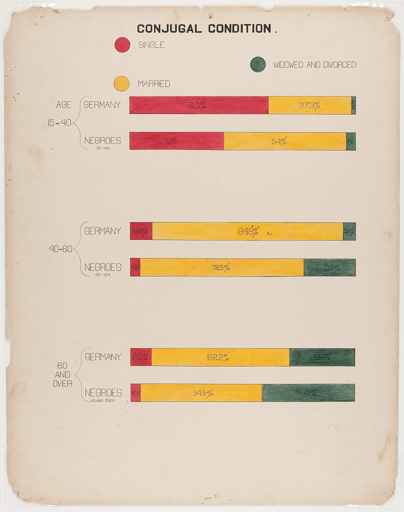
DuBois Challenge
A recreation of DuBois' “Proportion of Freemen and Slaves Among American Negroes” for #TidyTuesday week of Feb 16, 2021
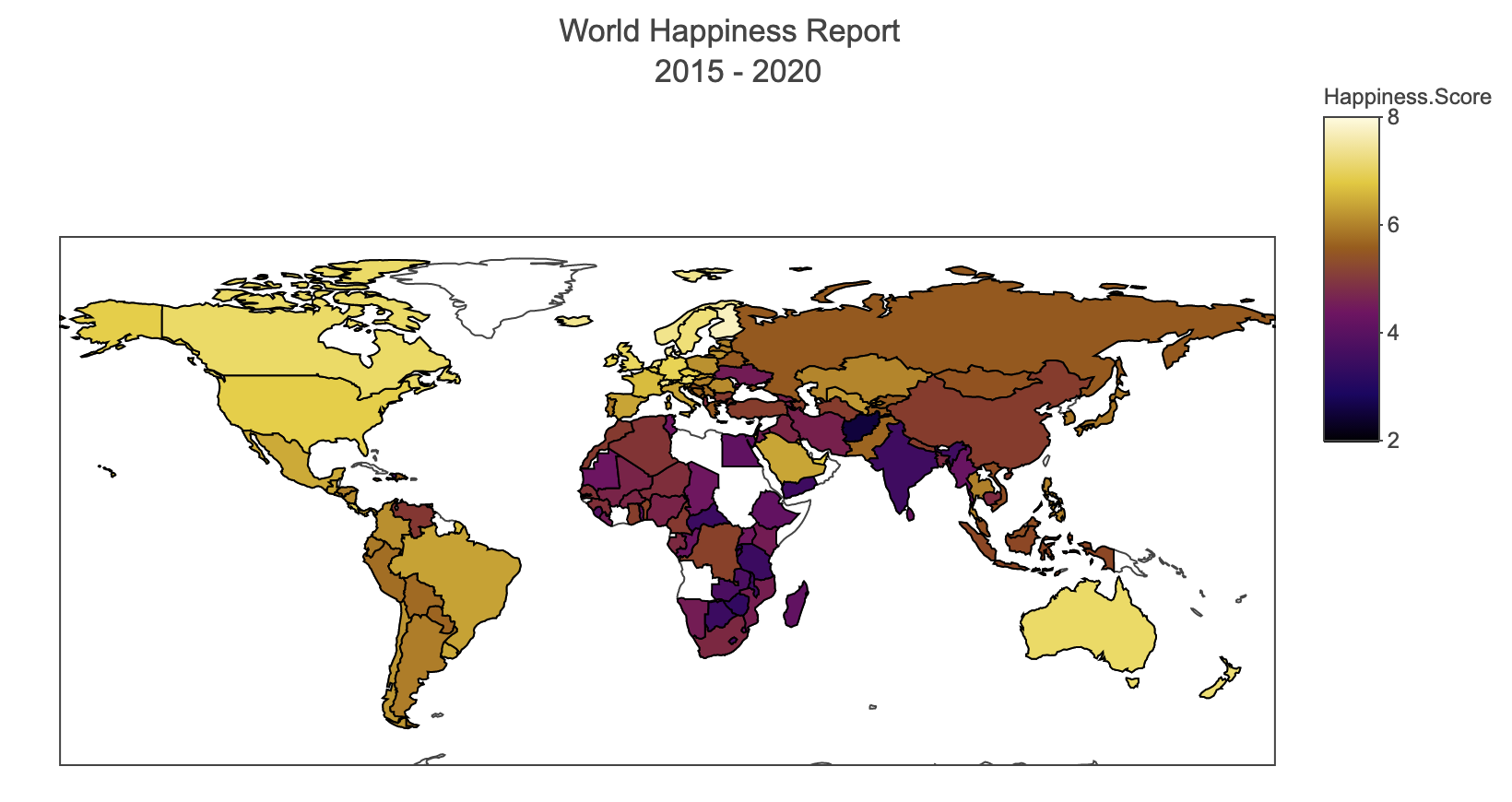
Happiness Trends in Music
An exploration of Spotify data alongside global happiness and crime data.
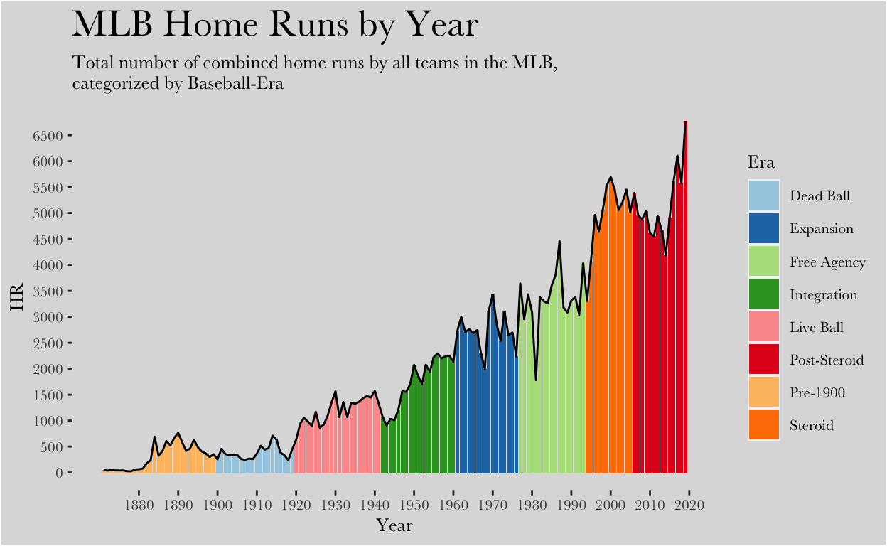
MLB Home Runs
Replicating and redesigning a visualization on home runs in the MLB.
Du Bois Challenge
A recreation of a Du Bois bar chart for #TidyTuesday week of Feb 16, 2021

Comparing Sample Means: Presidential Pardon Data
An Example using Two-Sample T-Tests.
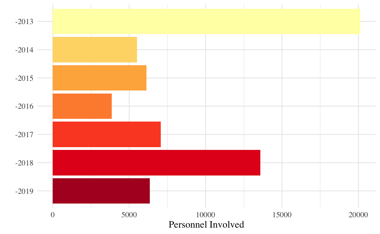
California Forest Fires
A visual exploration of wildfires between 2013-2019.
Welcome to Swat Data Viz
Welcome to the new site! I hope it fills out with some beautiful visualizations soon.